iA Presenter is impressive

I’ve just got an invite to use iA Presenter beta version. I signed up several weeks ago for curiosity and because of many good reviews from beta users.
What I can say after trying it is: “Wow! Impressive!”
First, the effort to create slides is minimal.
We only need to care about the content. iA Presenter will do the rest.
Of course, the output didn’t meet 100% of my expectation. Because many visual details can be better. But if you want to quickly create a presentation from your writing, the result is beyond expectation in a short time.
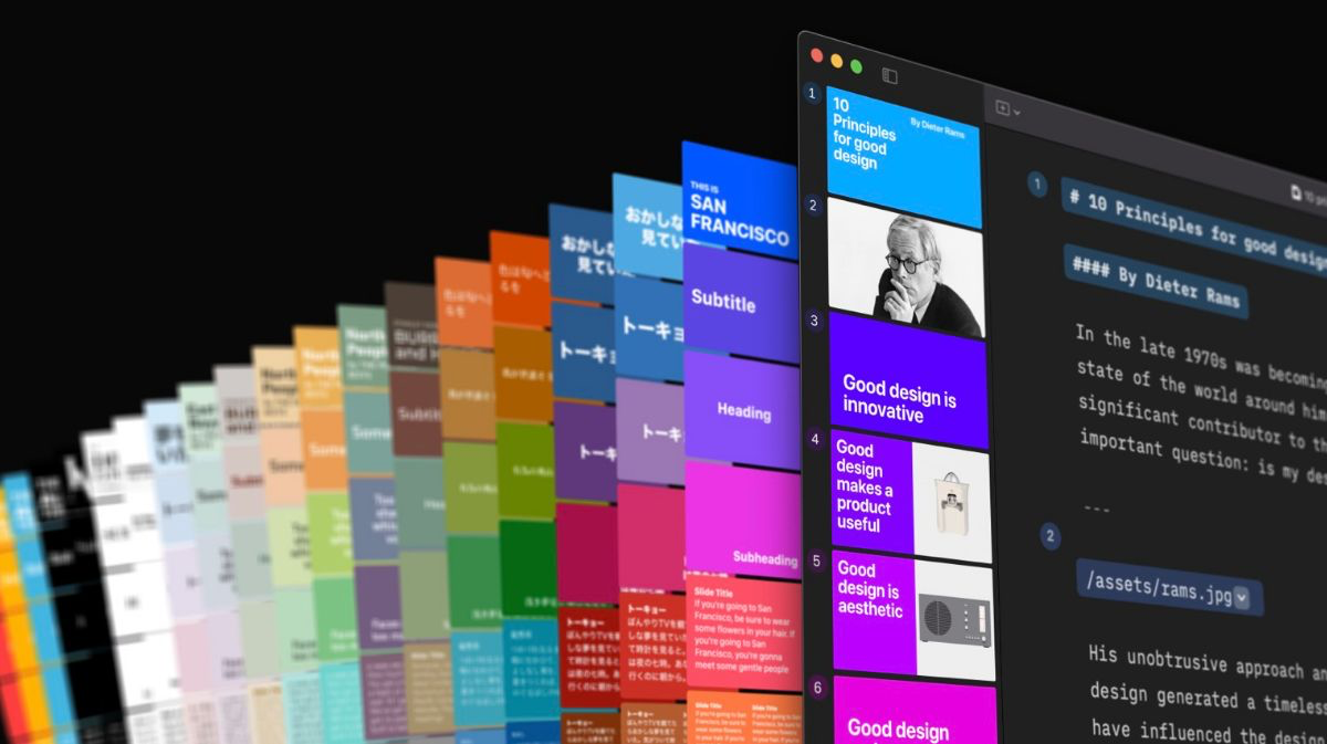
I love the slide templates of iA Presenter, which help me create the style I prefer. Different templates have different moods based on colors and typography. And the name of each template is, for me, very human: Tokyo, Paris, Copenhagen,…
Second, the learning curve is almost zero.
I thought that the learning curve would be challenging, but the app is very easy to understand and easy to use without learning much.


They don’t provide onboarding which I always skip. Instead, they show a concise & impressive video walkthrough on how to use it and the result you will get. I’ve seen the video on their website, so I skipped it. But for people who have never seen it, it would be impressive. I felt impressed with the video on their website.
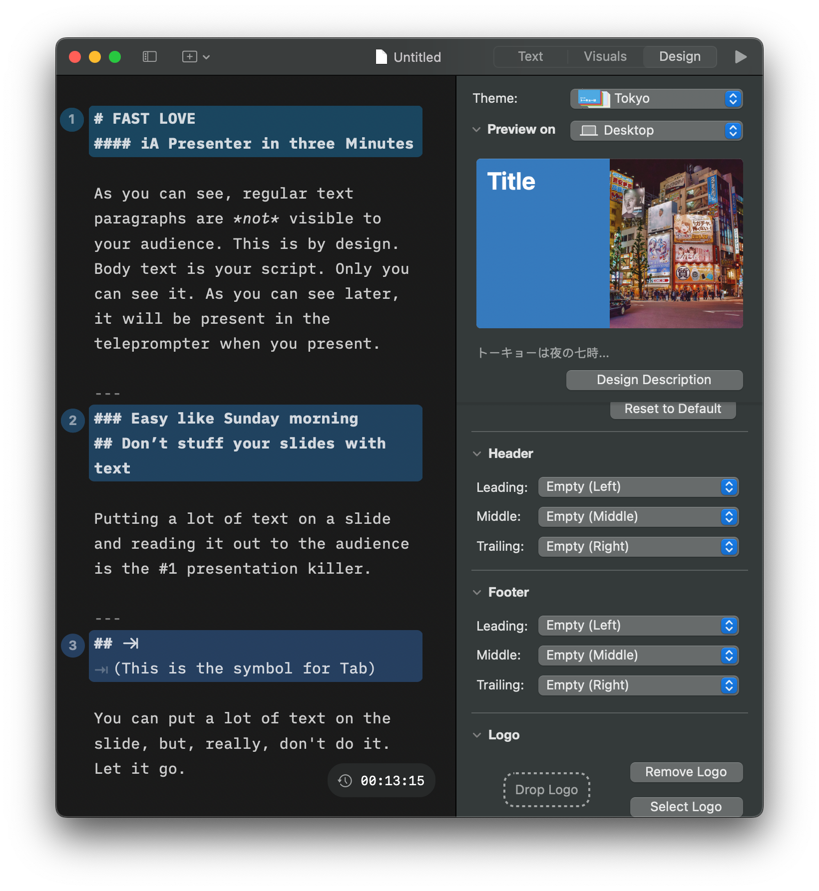
But the best part is how the UI is designed. It’s a great example of show, don’t tell. Creating a new document opens an example file with all we need for a presentation. It helps us learn by doing.
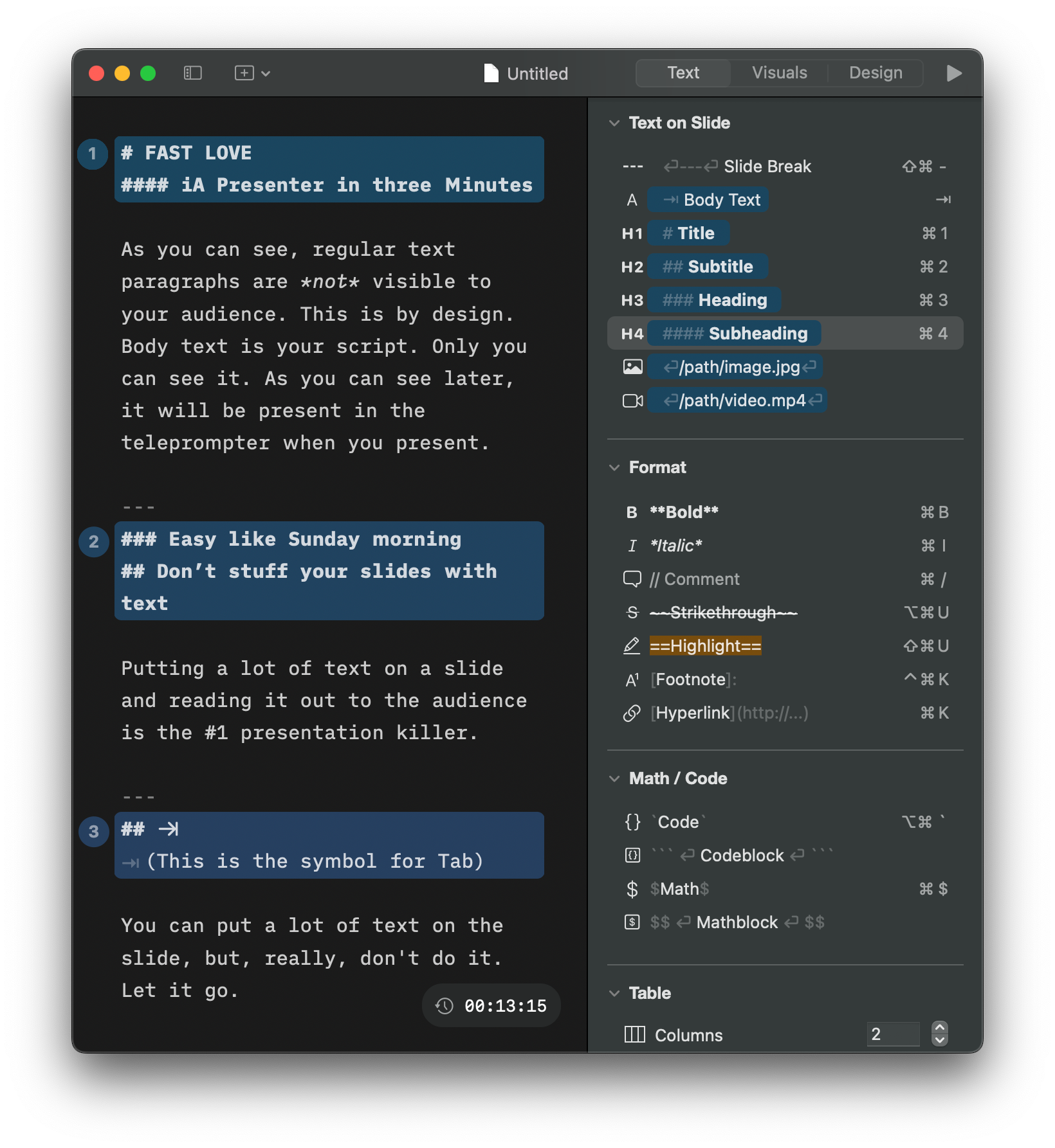
The detail I adore the most is the Toolbar on the right side. It does two things:
- Applying styles for the text like header, number list, bold text, italic text,…
- Show us how we can use markdown to create the slide.
That’s what we call: Show, don’t tell in UX Design.
Because of that, if someone has a habit of 🌱 Write first, present later (which I always do), the effort for creating the presentation is minimal with iA Presenter.
Third, the content of the example kind is awesome
It wasn’t created for the sake of a guide or tutorial. It was created thoughtfully by writers, making me engage with the content.
As a designer, I had a bias that the template was too limited for me. When trying the files, I stumbled upon one line:
Let it go….
My mind has shifted: “Yeah, let it go. It’s beautiful when it’s not perfect.”
I started to think back about my old or other people’s slides I have seen. It’s actually better. At least it doesn’t put a wall of text in the slide deck.
Final thoughts
I think the idea of creating slides from markdown notes is genius. It matches perfectly with the flow I found useful 🌱 Write first, present later.
The execution of iA Presenter is fantastic! I believe they will go much further soon.
Other notes:
🌱 Obsidian has the same idea. But the visual of the output is terrible. It’s understandable because it’s free. We can’t expect much more.
iA Presenter is positioned as a paid tool, an expensive paid tool, and that’s why it’s that good.
But I’m wondering who inspires who on this idea?

