
Revamping Carousell’s Web for Cars & Property
How I nailed the experience and boosted sales by +12% for Cars and Property
| Platform | Desktop & Mobile Web |
| Categories | Cars, Property, General Classifieds |
| Markets | Singapore, Philippines, Hong Kong |
| Duration | 1 year |
| Time | 2021 — 2022 |
| Team | 3 Product Managers, 3 Product Designers, 10+ Engineers. |
| Role | Design Lead |
Carousell rules Southeast Asia’s classifieds—20 million users buying everything from clothes to phones, across 7 major markets.
But Cars and Property? Those big buys needed a web that worked. I jumped in and made it happen, big time.
Why Revamping?
Carousell started as a phone app—web was just a secondary offering. But
Cars and Property buyers—power searchers who research for 3-12 months—rely heavily on web for detailed browsing.
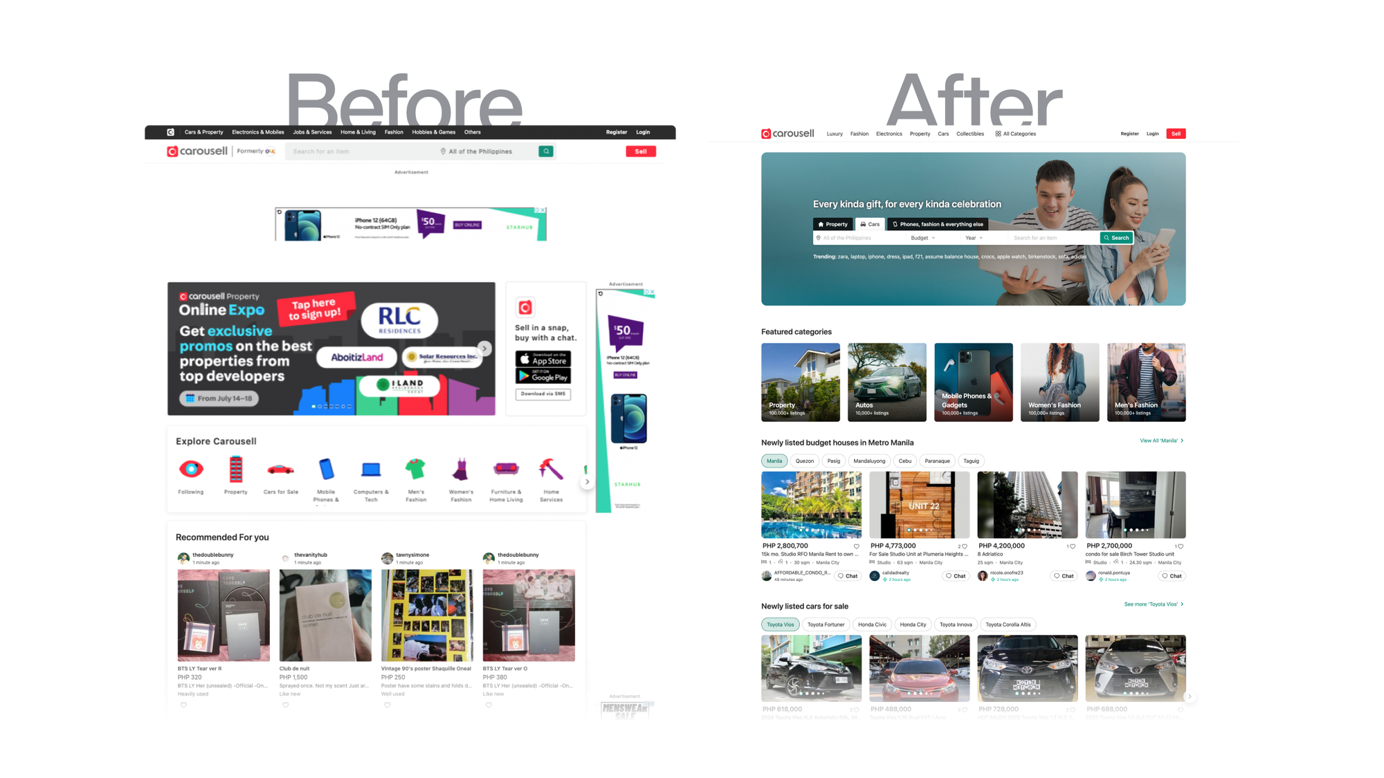
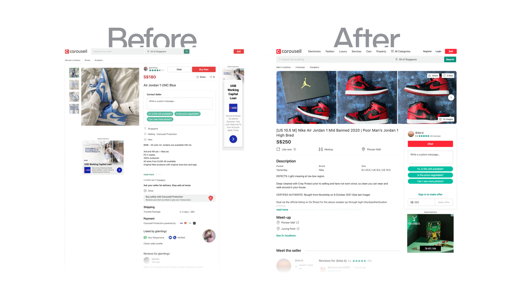
The old web? Searches were bad, listings looked shady, and the design was messy. I had to fix it—make it easy, boost sales, keep ads, and still feel like Carousell.
The Problems
User’s first impression is full of Ads — External ads, big SPC, download app banner. Ads is everywhere.
The search result relevancy is low in Cars & Property categories — Different needs of search for different categories. Almost all users use the global search to search for everything (i.e.: location for property, make/models for cars)
Listing detail page is broken — Property & Cars buyers need to see many info. The page was getting worse and less trustworthy → People are not converted
Design Goals
Create a flexible, intuitive web experience that boosted conversions without sacrificing ad revenue or Carousell’s unified identity.
Insights
What we learned from our users
My PM and I chatted with car and home buyers in Singapore & Philipines to figure them out. Here’s what I found:
- Car buyers — Obsessed with budget, make & model, and registration year. They’re laser-focused and won’t settle for less.
- Home buyers — All about neighborhood, property type, and price. Location’s king, and they’re ready to dig.
- The big reveal — Both are power searchers—detail junkies who’ll browse for months (sometimes a year!) before pulling the trigger. Generic search? Trash.
These nuggets weren’t just Singapore’s story—they echoed across the Philippines and Hong Kong, shaping a playbook that scaled.
Bringing Ideas Together
I teamed up with two designers—one focused on buyer experience, another on cars—to nail the Cars and Property journey while fitting it into Carousell’s bigger picture.
We had tons of ideas, from layouts to bold new directions. As the project lead, I blended those views and sold my vision for the best path.
Weekly syncs, open talks, and tons of iterations got us in sync— not just designers, but also PMs, engineers, and stakeholders. The more we hashed it out, the sharper our focus got.
Then, I dug into the details.
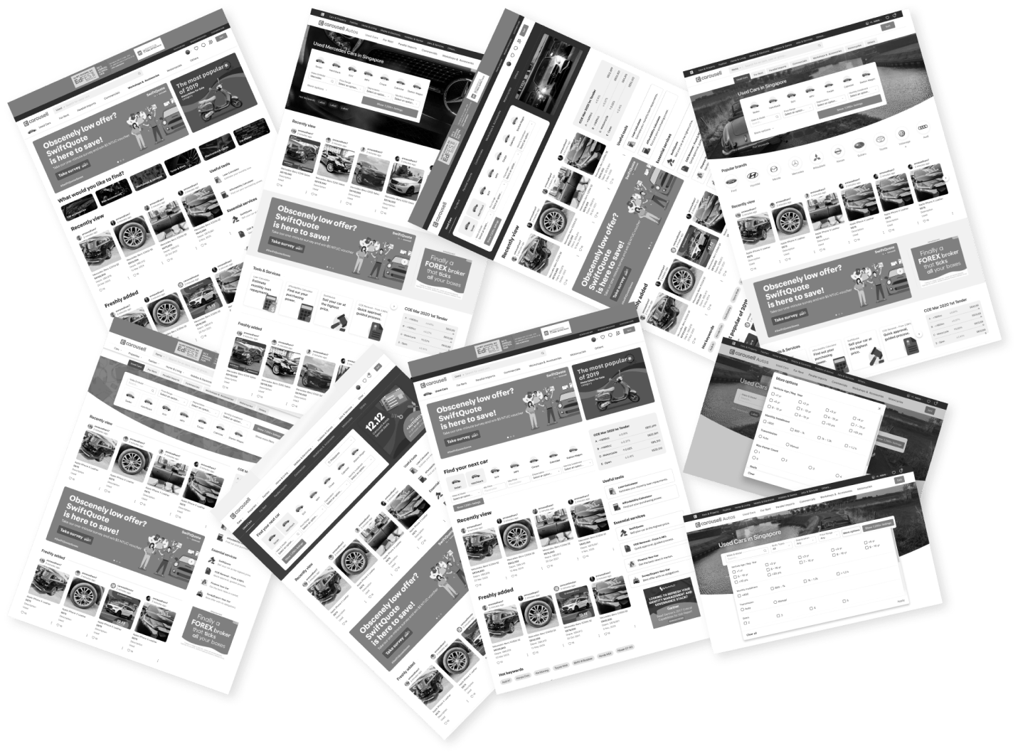
The new web experience
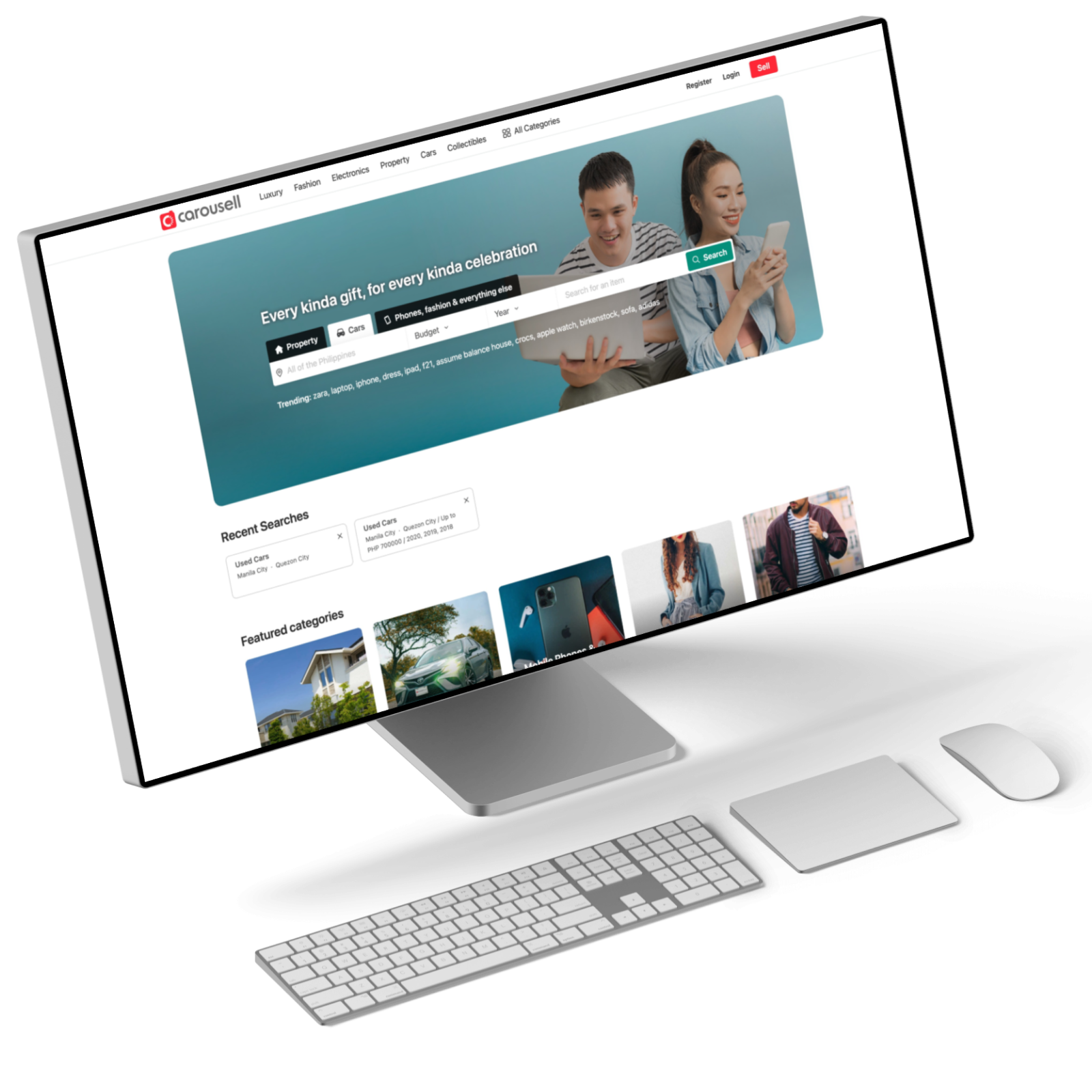
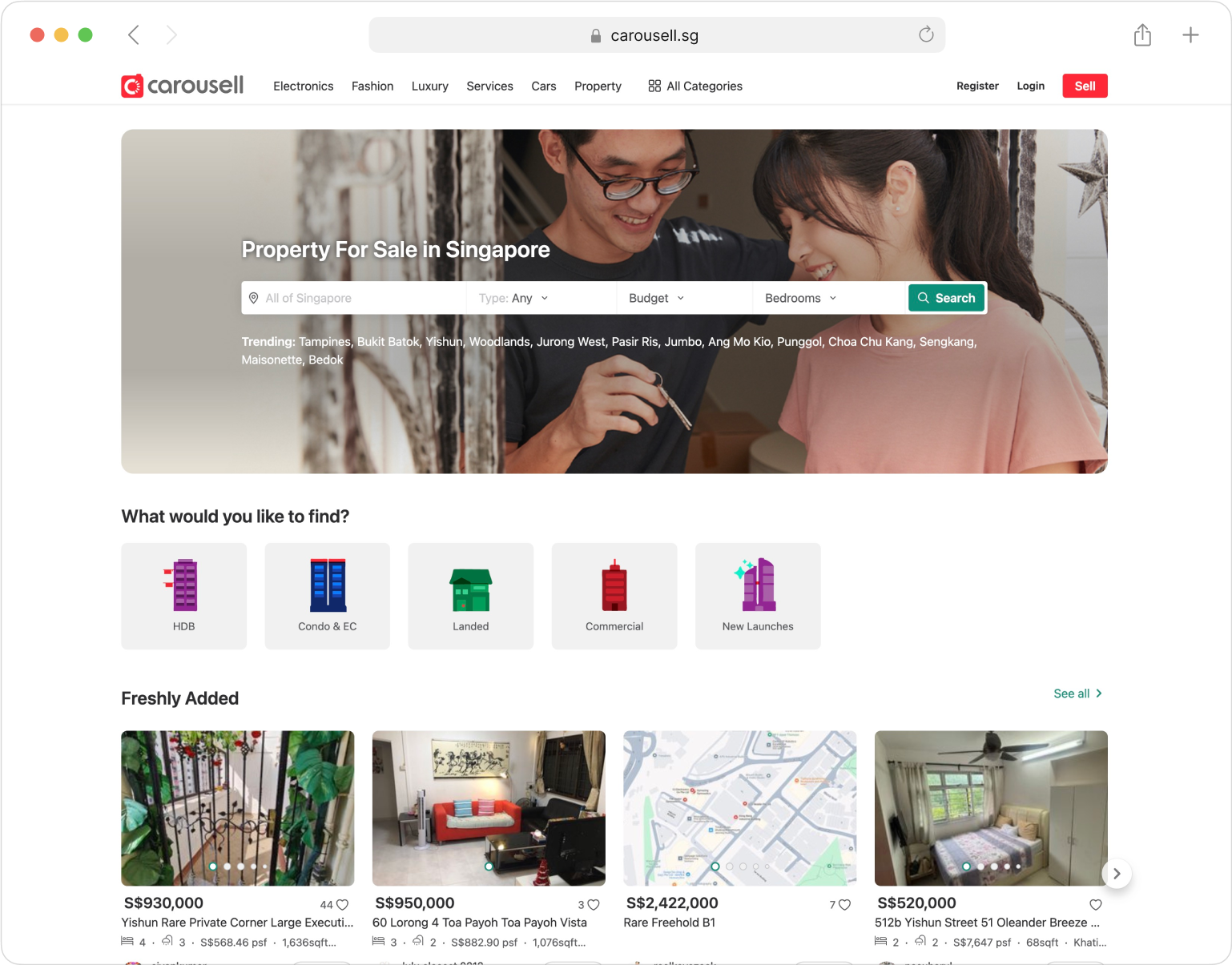
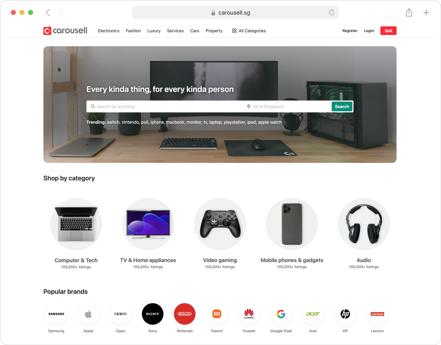
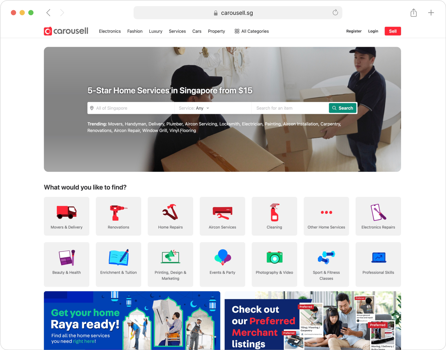
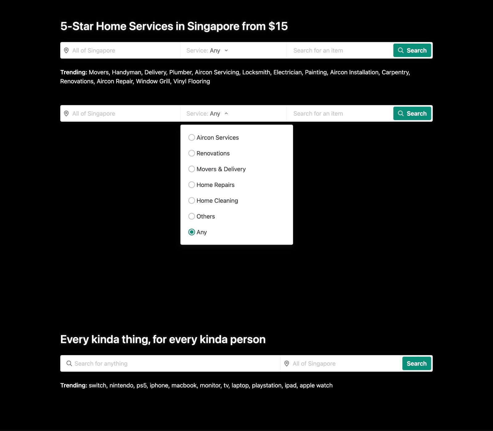
New home for Cars and Property
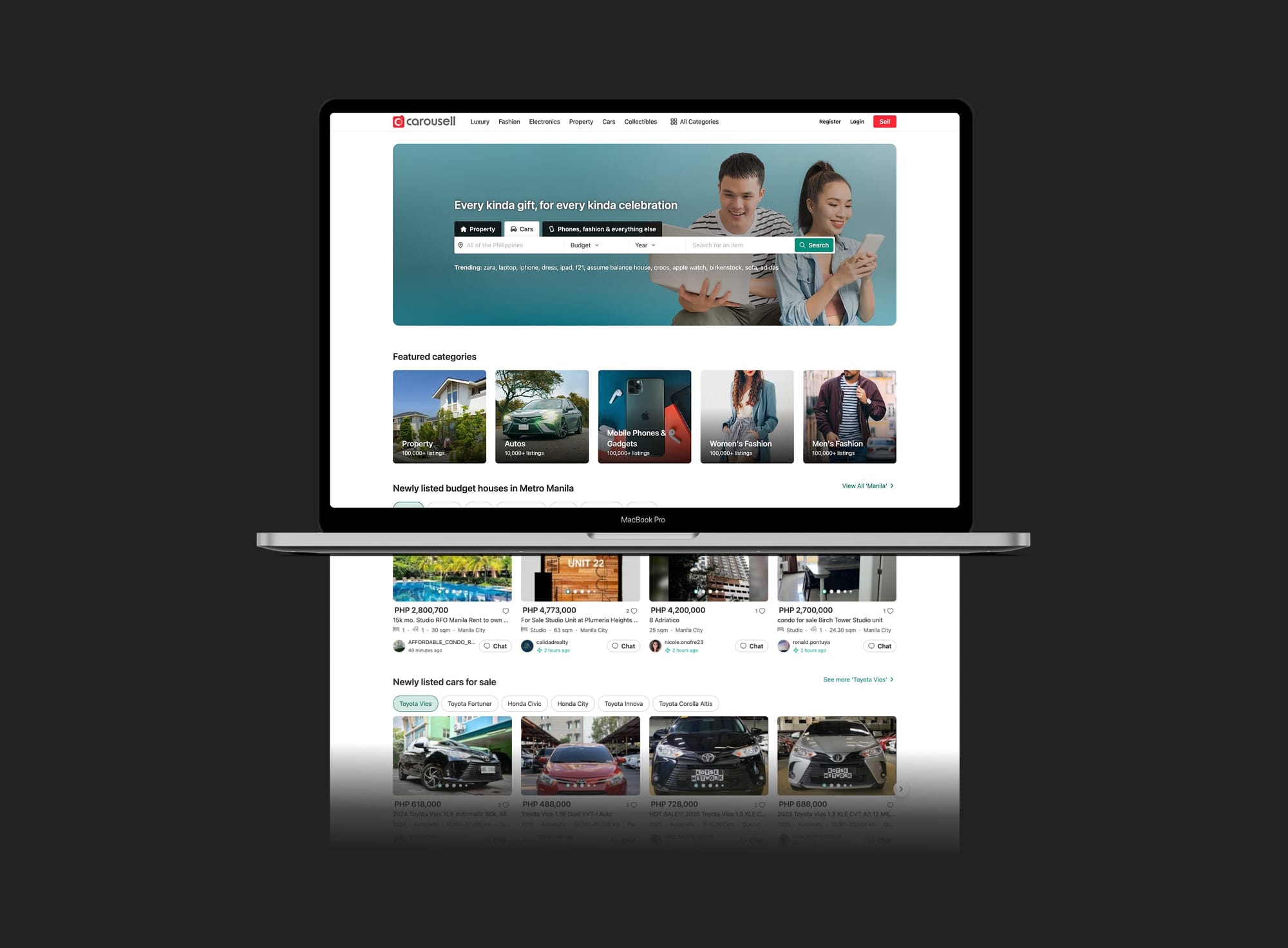
Dedicated homepage for each featured category
Filter-driven homepages for Cars and Property put power searchers in control, complemented by editorial content to inspire casual browsers.
The flexible template also supported other categories (e.g., motorbikes, phones, home services,...) and localized launches across markets.
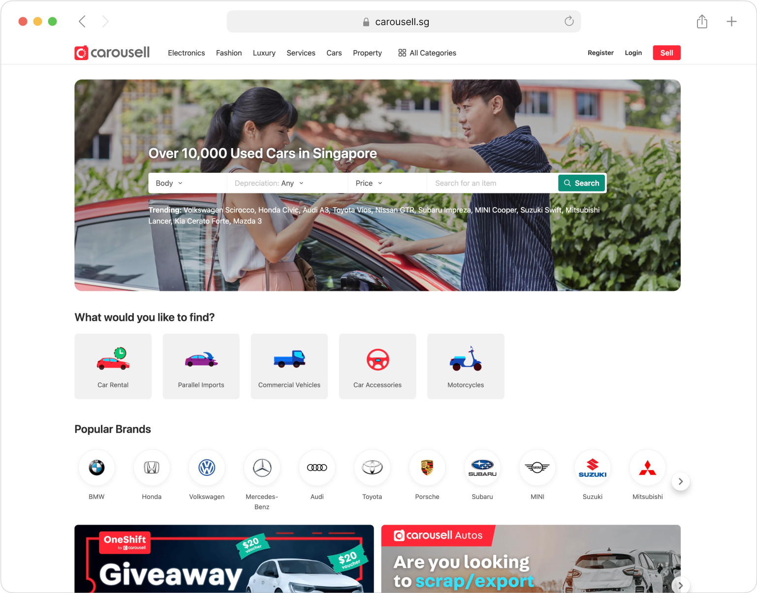
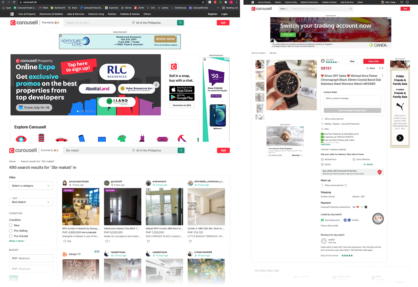
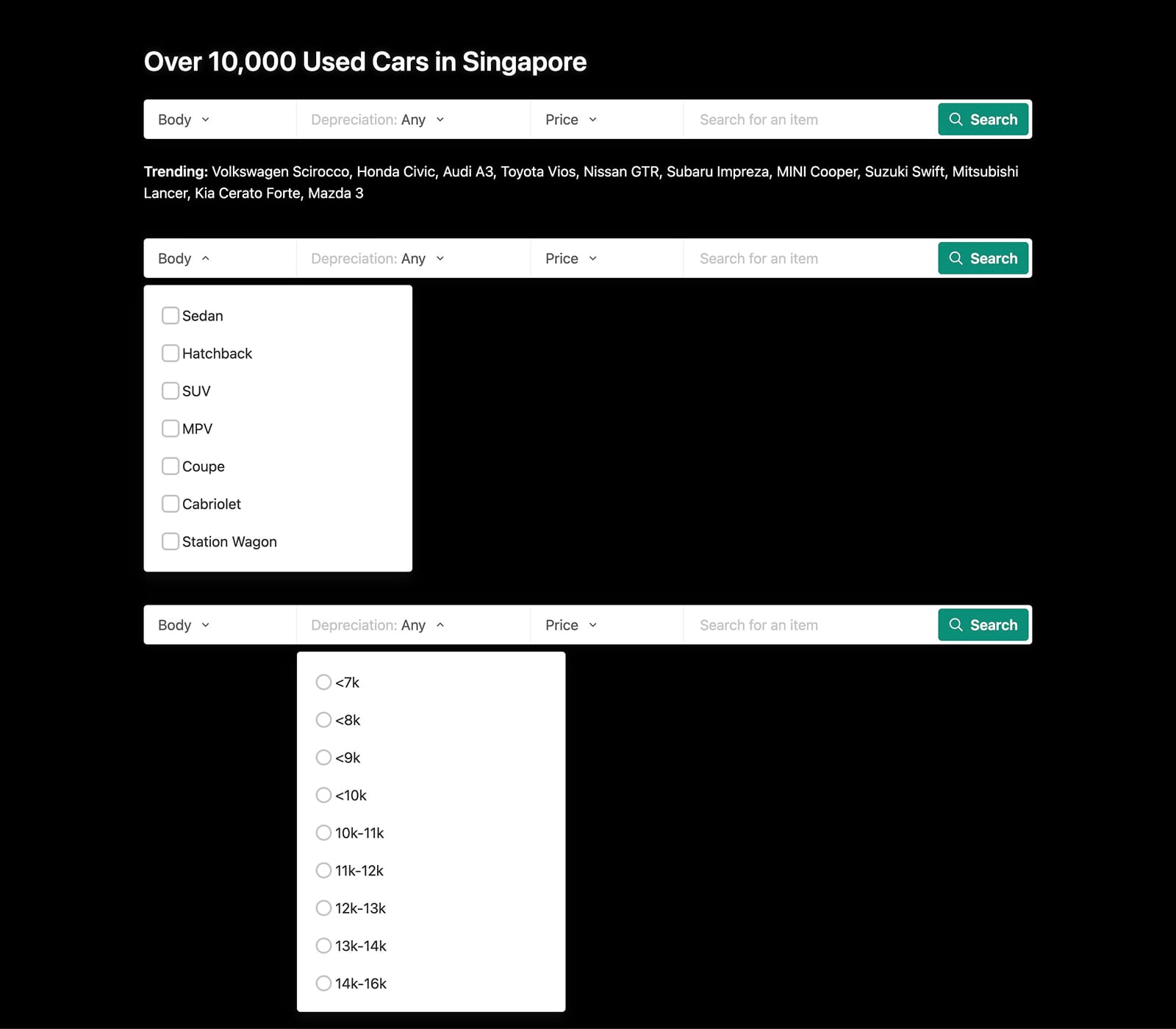
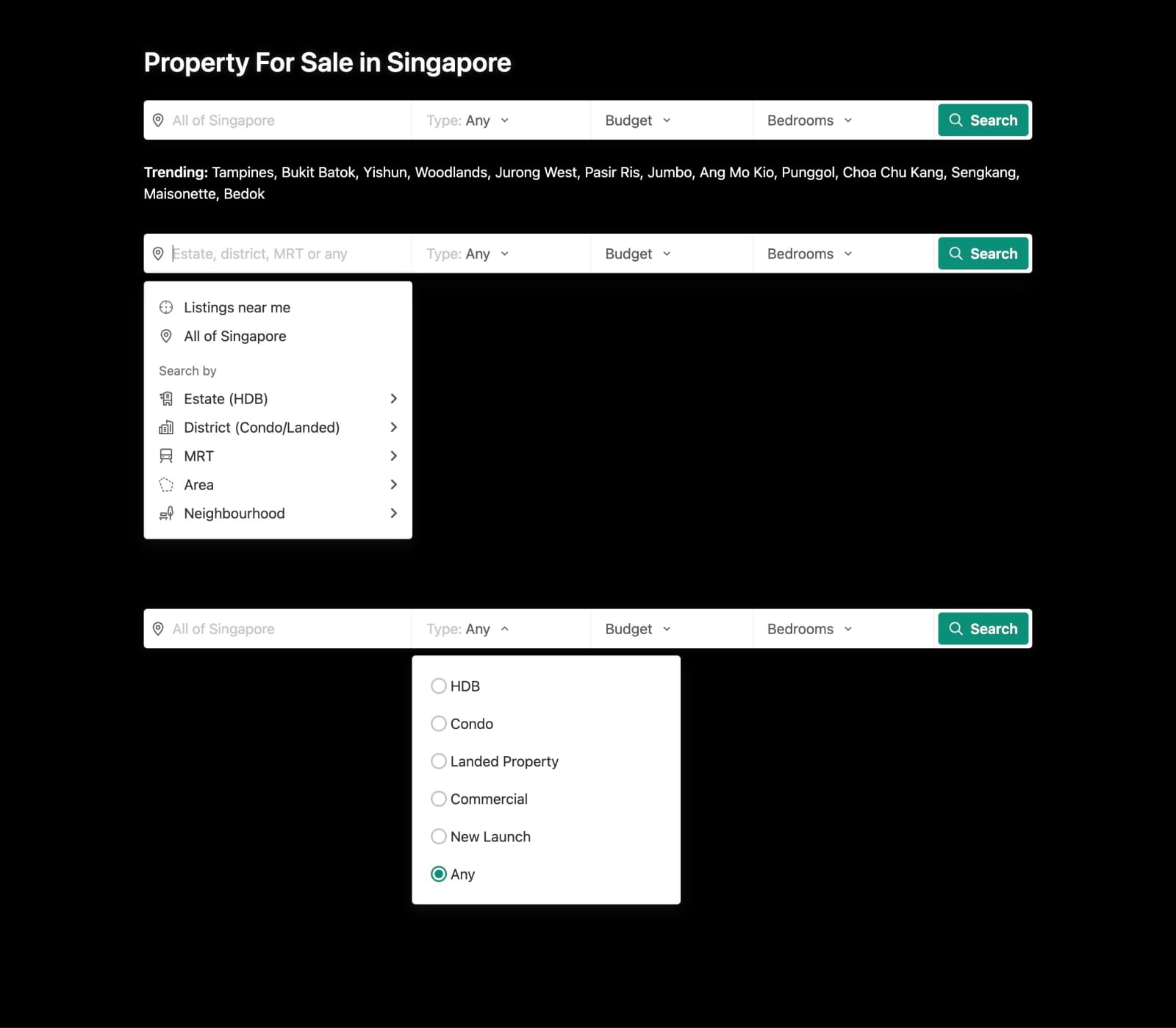
Different search & filter for different categories
The needs for search differ across categories.
Property and car users are power searchers with specific criteria.
Property users prioritize location, followed by type, budget, and room count.
Car users focus on makes, models, body, and budget.
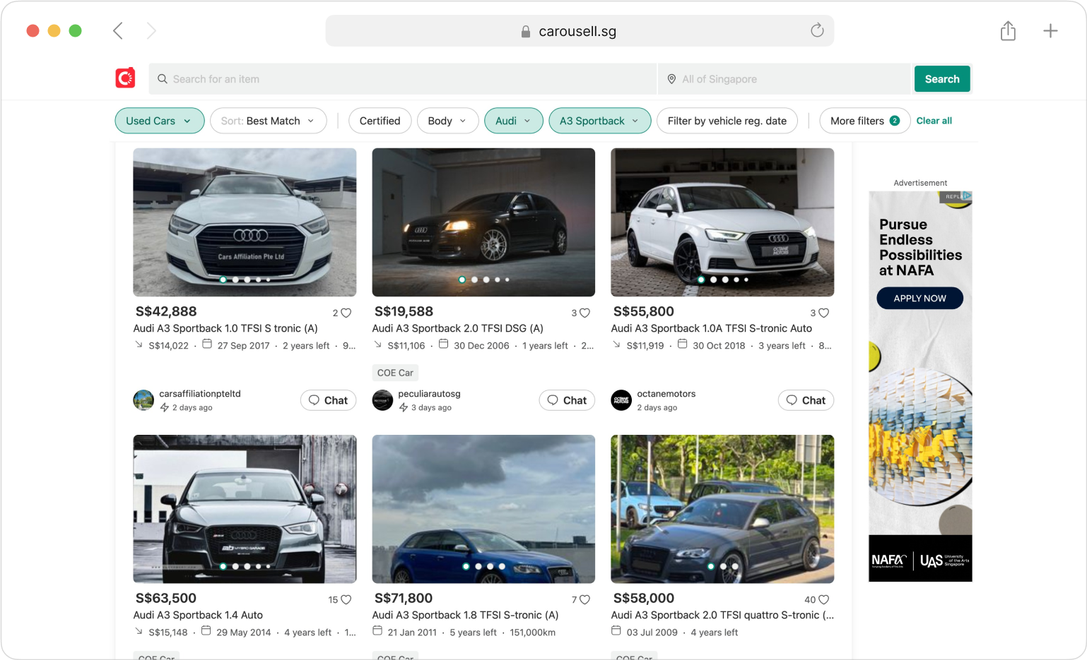
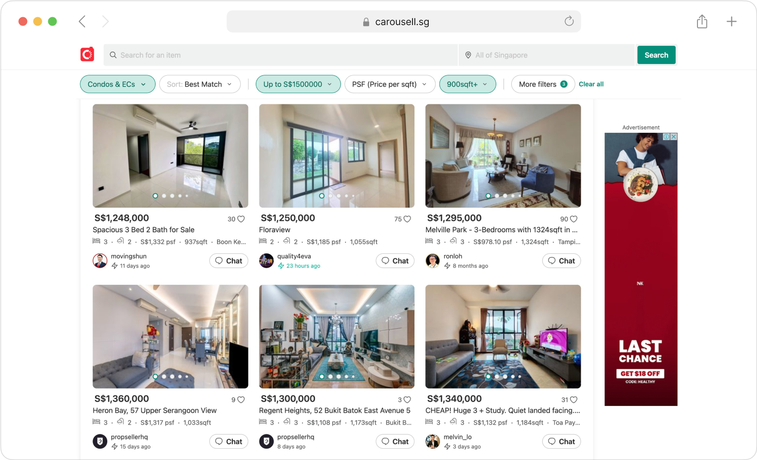
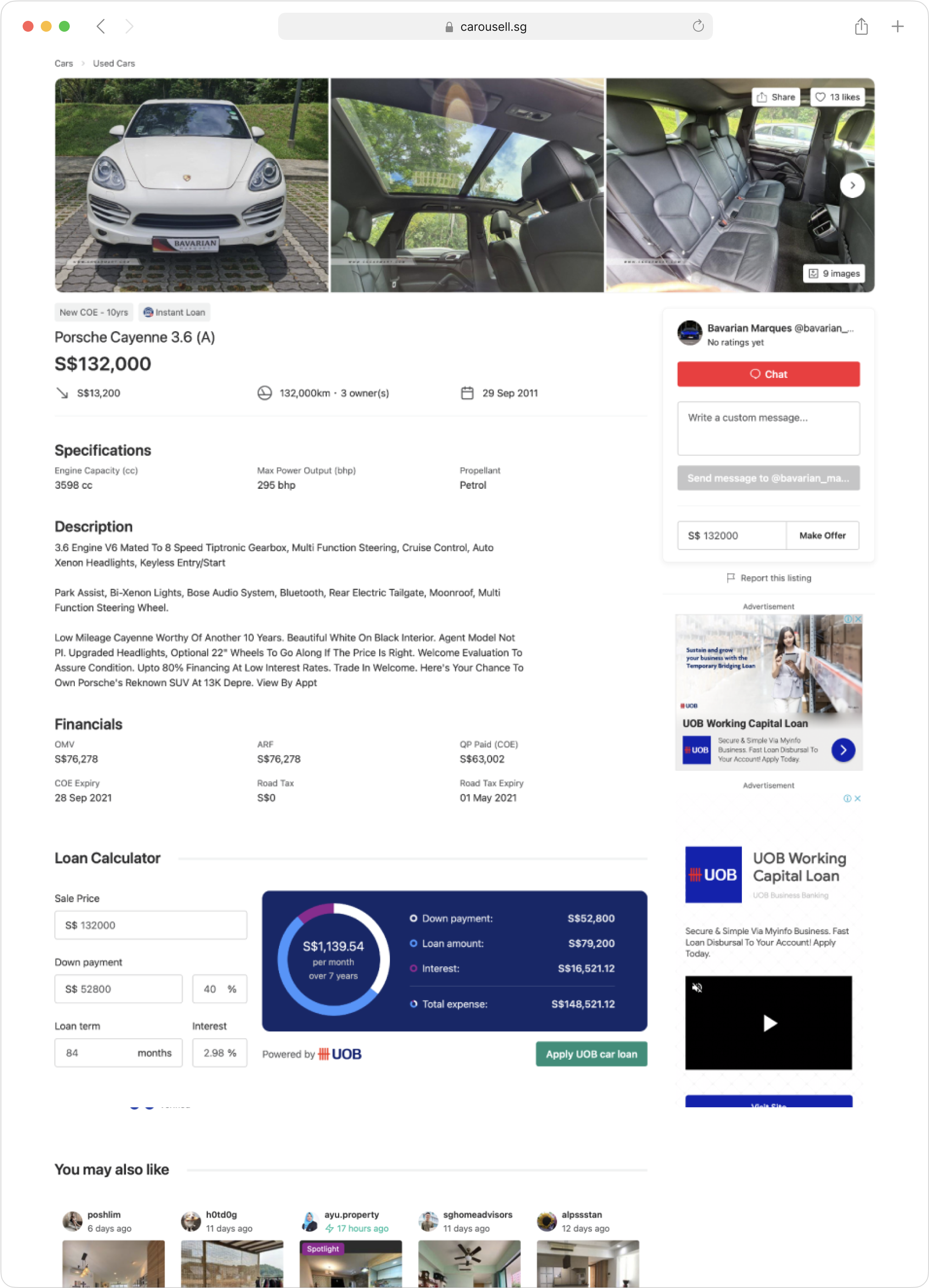
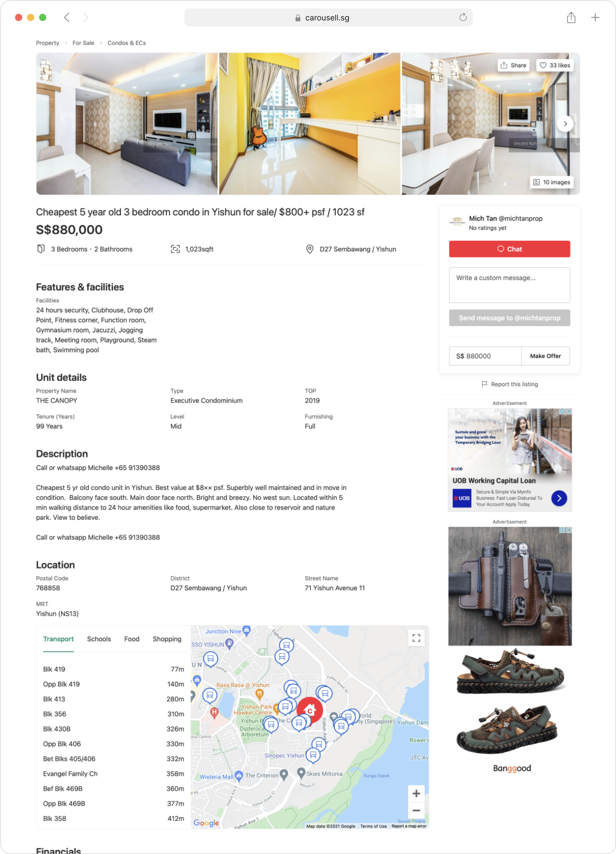
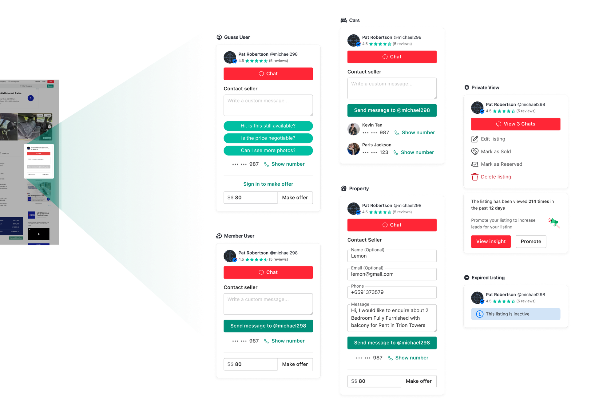
A refined listing detail page
Together with new landing pages, we also want to improve the experience for the highest traffic page: listing detail.
Different categories have different attributes. To make it easier to design, we broke them into 4 main categories:
- Cars
- Property
- Service
- General Goods (Electronic, fashion, furniture,…)
There are different needs for showing information for each category. Some categories have many attributes (Cars, Property), some have fewer attributes (Service, General goods). But we aim to smoothen the experience when people browse in different categories. So we want to have one design that fits all categories but still customizable.
For each category, we defined key attributes, secondary attributes, and common attributes then group them.
The Results
Positive results and much more to do
- Chats per user jumped +15%—people loved talking!
- Deals per user rose +12%—more sales happened!
- Total chats grew +2%—the buzz got bigger!
- Ads kept making money—no worries there.
- Set up the web for more cool stuff later.
*For confidentiality reasons I have omitted the actual values for these metrics.
Takeaways
This project turned a neglected web platform into a powerful tool for high-value buyers, proving that user-centric design can drive engagement and revenue in tandem.
There’s more to refine, but this foundation sets Carousell up for scale.