
Perfecting the Browsing Experience
Rethinking the browsing experience for the classified marketplace in Southeast Asia
| Platform | iOS, Android, Web |
| Categories | Cars, Property, General Classifieds |
| Markets | Singapore, Philippines, Taiwan and others in SEA+ |
| Duration | 9 months |
| Time | 2019—2020 |
| Role | Design Lead |
| Team | 3 Product Managers, 3 Product Designers, 10 Engineers. |
Context
The Challenges
Started in 2012, Carousell launched the first mobile app in Singapore. In 2020, Carousell transformed into the biggest classifieds marketplace in Southeast Asia, with 20+ million users across 7 major markets.
In 2019, after acquired and migrated OLX Philippines, Carousell became the biggest classified marketplace in the Philippines.
The app was primarily designed for Singapore, a small country, struggled to scale to multi-city countries like the Philippines, Malaysia, Indonesia.
Rebuilding the location while browsing and searching for items is one of the most important things we need to improve.
We have three high-level problems that we need to solve:
- How to make the location picker easier to use for everyone in different countries?
- How to make it works for different categories (General goods vs Property vs Home Service) when the searching behaviour is very different?
- How to increase the relevancy on browse and search journey?
My Role
I led the design of the new location picker across iOS, Android, mobile, and desktop Web since the outset of the project in May 2020.
| Insights & Ideation | Planning & Scope Definition | Design Execution & Validation | Leadership |
|---|---|---|---|
| I partnered with three product managers and two other designers to uncover insights, ideate, and translate concepts into features. | I defined the product with my product manager. I prioritized and negotiated features for launch and beyond. | I designed for iOS, Android, mobile Web, and desktop Web. I executed journeys, wireframes, prototypes, usability test, design specs, and collaborate with Engineers. | I presented works to gain buy‐in from executives, senior stakeholders, and many other teams throughout the project lifecycle. |
Insights
What We Know about Our Users & Data
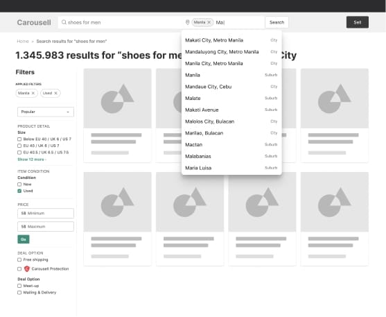
The radius location doesn’t work for big countries
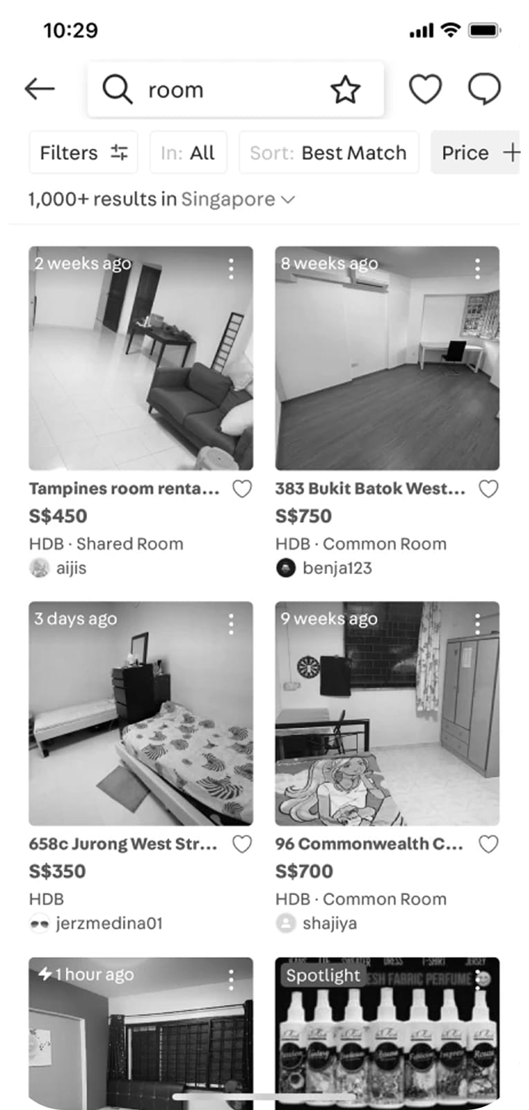
The app was first designed for Singapore so we took the radius approach. When searching items, buyers pick a location and use a radius to expand or collapse the area to filter the items.
This approach works for countries like Singapore, Hong Kong, and Taiwan where the transport is convenient and small. People can go anywhere with convenient public transport.
When bringing it to bigger countries like the Philippines, Malaysia, Indonesia, people don’t understand it. In another word, the radius is not useful there, where 1km from a location could mean in a different city or an inaccessible area.
The old radius location picker
Feedback from users
We reached to our Customer Voice colleagues frequently to ask them for feedback from our users. After migrated OLX to Carousell, we got a lot of feedback about the location.
Many people don’t know how to use the radius location picker
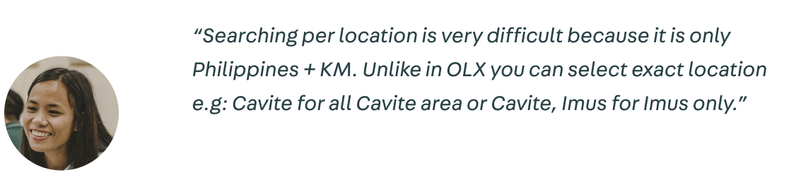
Some people don’t know they can filter by locations

Not only getting insights from Customer Voice, but I also dived into some user researches that other colleagues did in the Philippines to get a deeper understanding


A deeper understanding with data
Qualitative insights from users are not enough to convince stakeholders to invest in this project. I worked with a PM and Data Analyst to pull out some data to cover for our assumption. We know that:
- If people use the location filter, the View listings to Transaction conversion is 50% higher than without using the location.
- The further away listing from the user’s location, the lesser chance of being transacted.
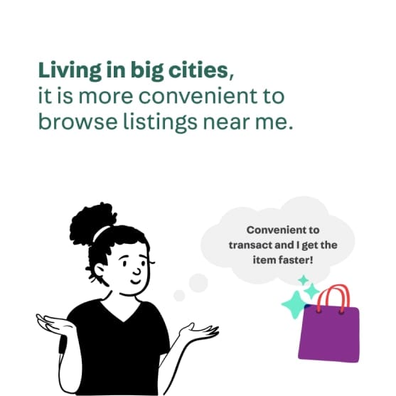
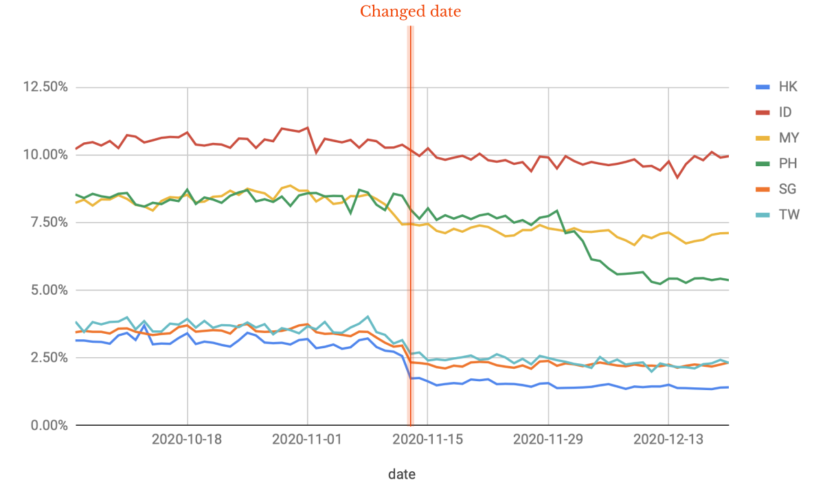
- The usage of location picker is very high in multi-city state countries (15%), but very small in Taiwan, Singapore, and Hong Kong (2%).
Note: For confidentiality reasons, I have omitted the actual values for these metrics.
Frame the Problem
The Importance of Location
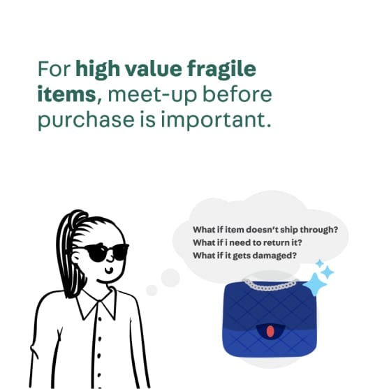
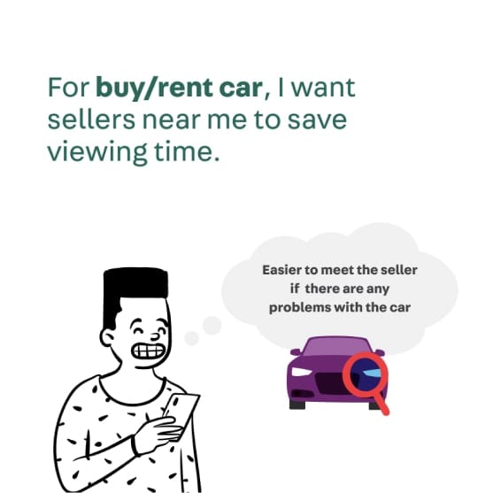
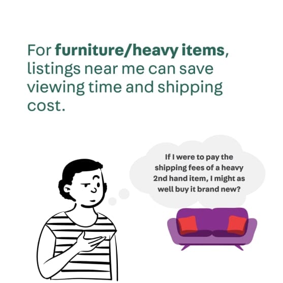
Carousell is a classified marketplace, more than half of the listings are used ones. People usually do meet-ups to check the item before buying it. So knowing the location around their areas is very important.
To make it easier to communicate our ideas to other people, we created a storyboard to convey our understanding.
Thanks to Felipe and Mag for those amazing storyboards
Explore ideas
How We Built
After everyone was on the same page and got a common understanding of the problem and the importance of location.
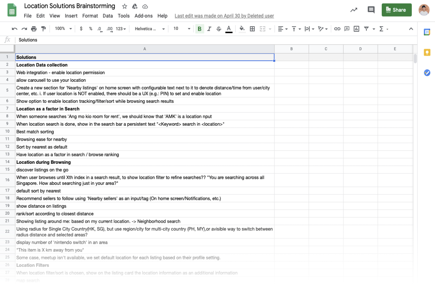
Brainstorm to find ideas and prioritized them
With two Product Managers and two other designers, we did brainstorm to find ideas and prioritized what we should do for the new location pickers.
Rough wireframes/mockup to visualize ideas
In a big organization, the earlier we share, the smoother process.
To communicate our ideas early, I started with wireframes (web) and rough mockup (app) then share with other designers to get feedback. It’s also a good deliverable to share with people outside of product teams about the solution.
Discuss & narrow down ideas
- Come up with many ideas as possible
- Share it with the whole Product Designer team to discuss
- Updated the design and shared it with stakeholders
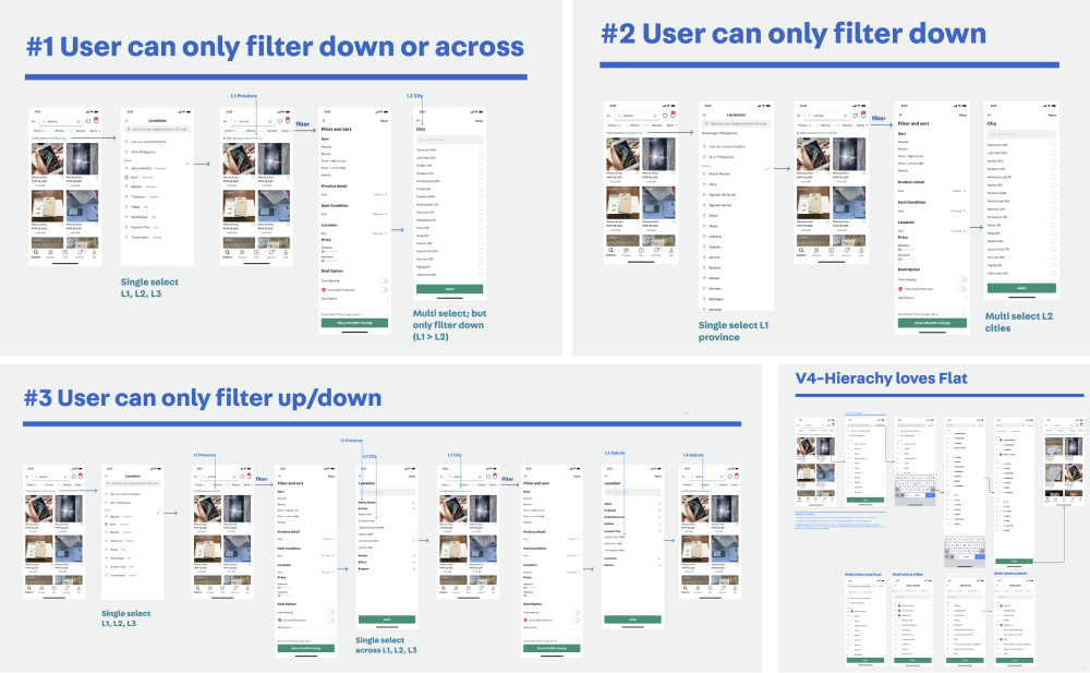
Usability testing
There were still two ideas that we can’t agree on. So I used both two ideas to do a usability test to see how people interact.

The good thing during the pandemic period is that we don’t have to limit the participant physically. So we can recruit people in the Philippines without going there. With a bit of preparation, we did it very smoothly.
With the insights from the test, we are more confident with the solution and get alignment from the team. And I’m confident to spend more time in the detail and refinement.
Details
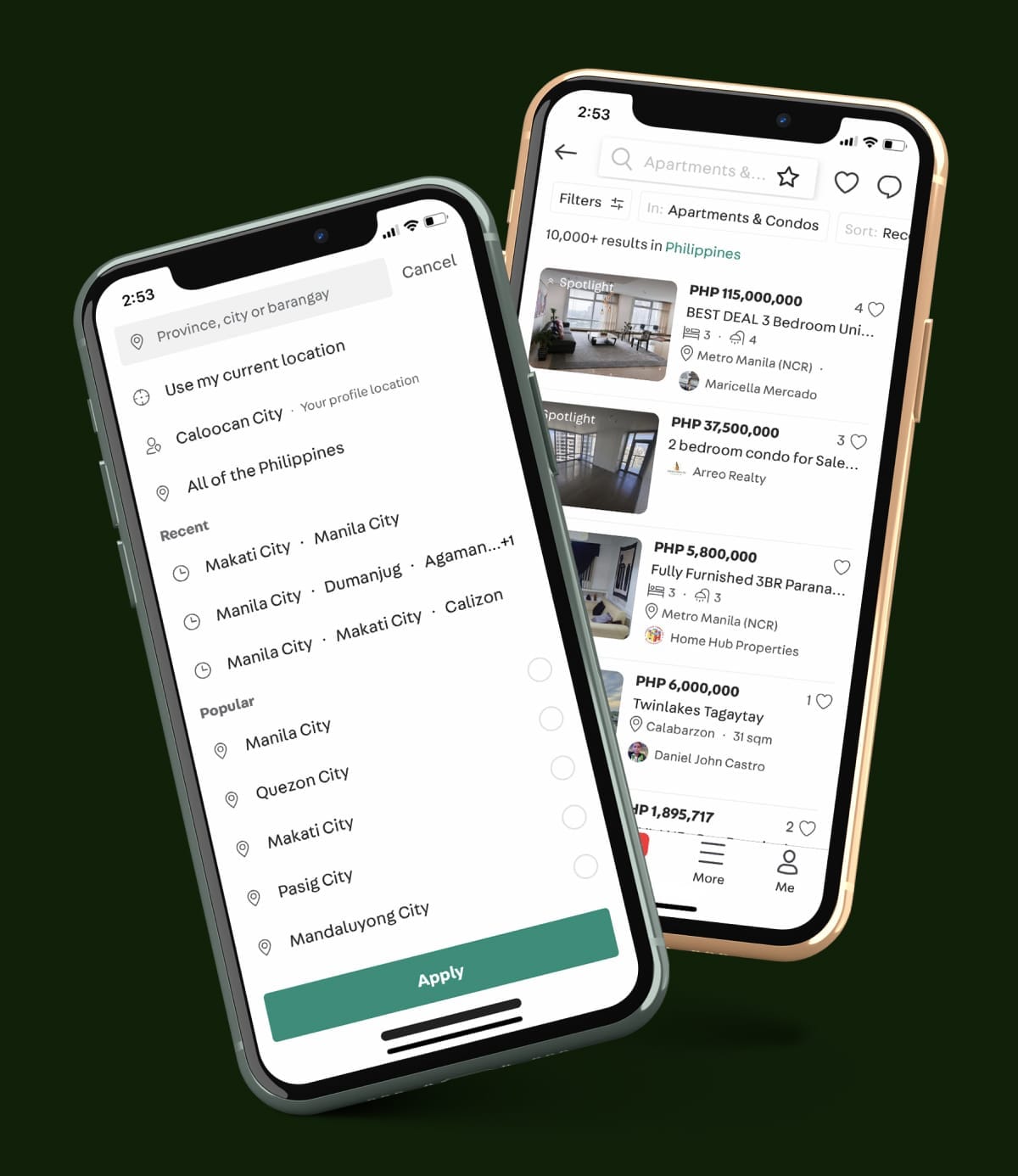
The New Browsing Experience
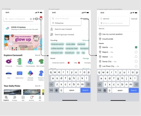
Multi-area location navigation
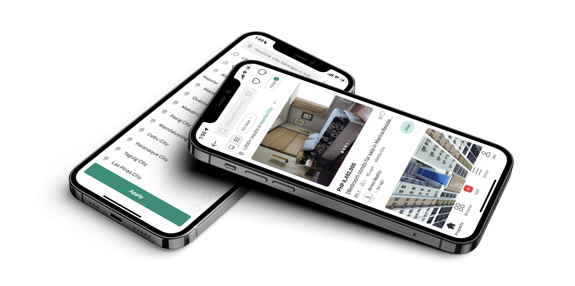
Moving out from radius location, replace it with location areas.
Browse by administrative areas and enable users to select multiple locations (such as home and work) when searching for listings.
Browse listing by areas
Browse listing in multiple locations
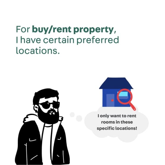
For Property
Location is the most important criteria when searching for any house or room. So we replace the global search bar with the location picker.
A walkthrough of location picker for Property
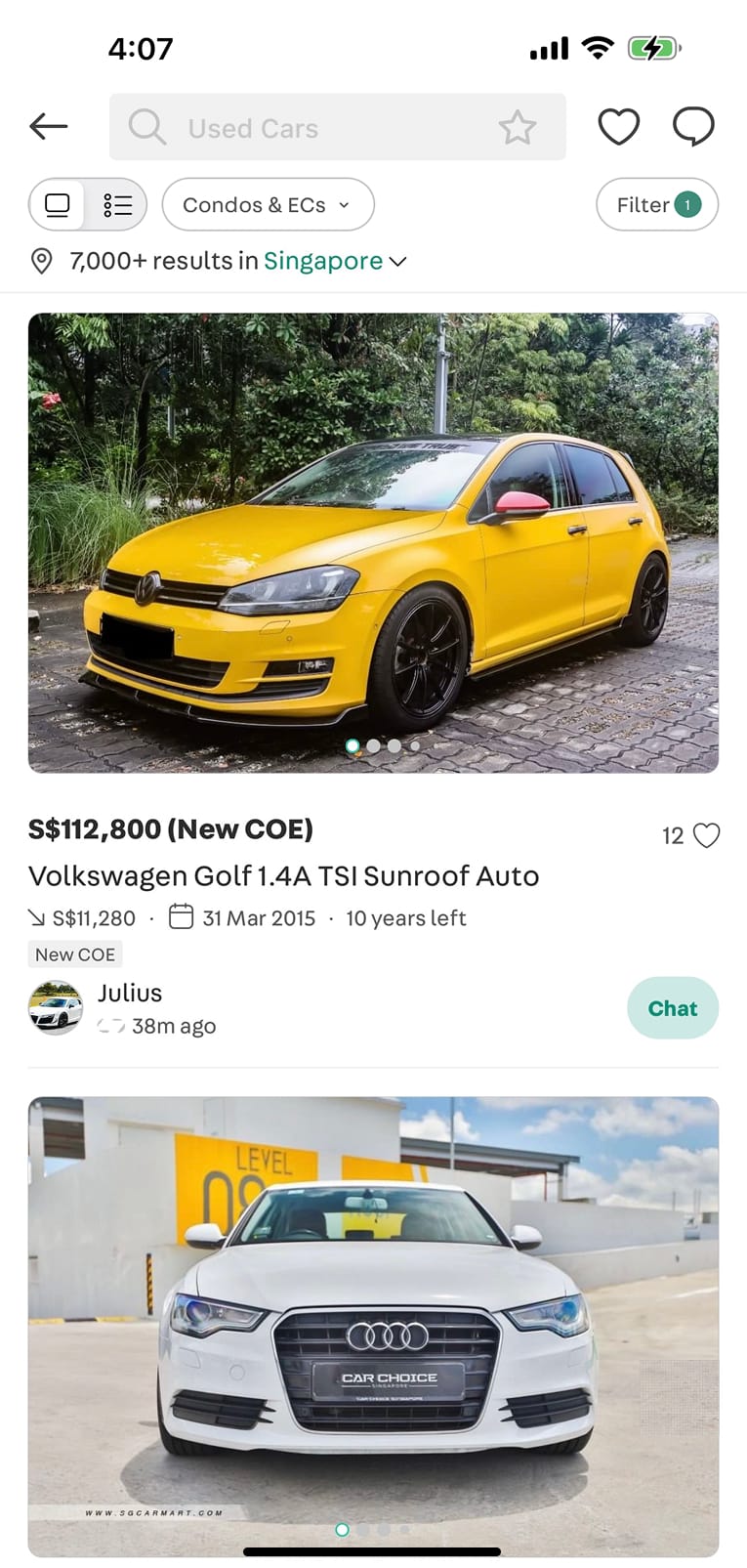
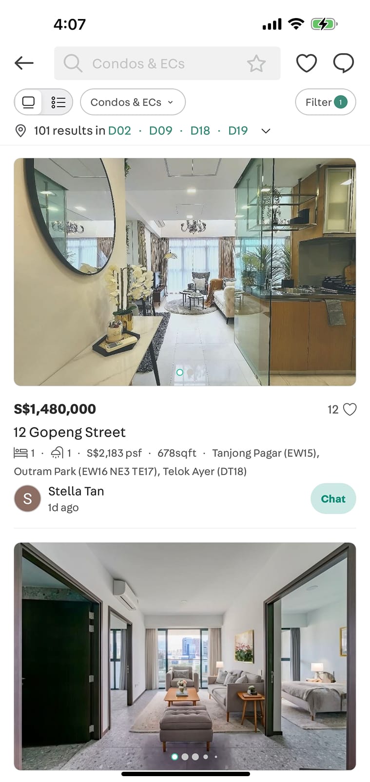
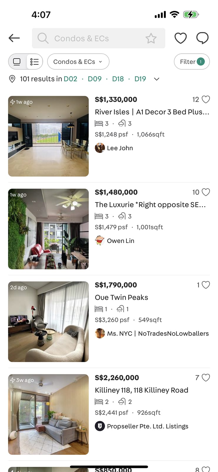
A better listing card for Cars, Property, Home Services
For property, we created 2 new listing card layout, list view and gallery view, to show more information. Location of a house is an important information to help people find suitable houses easier.
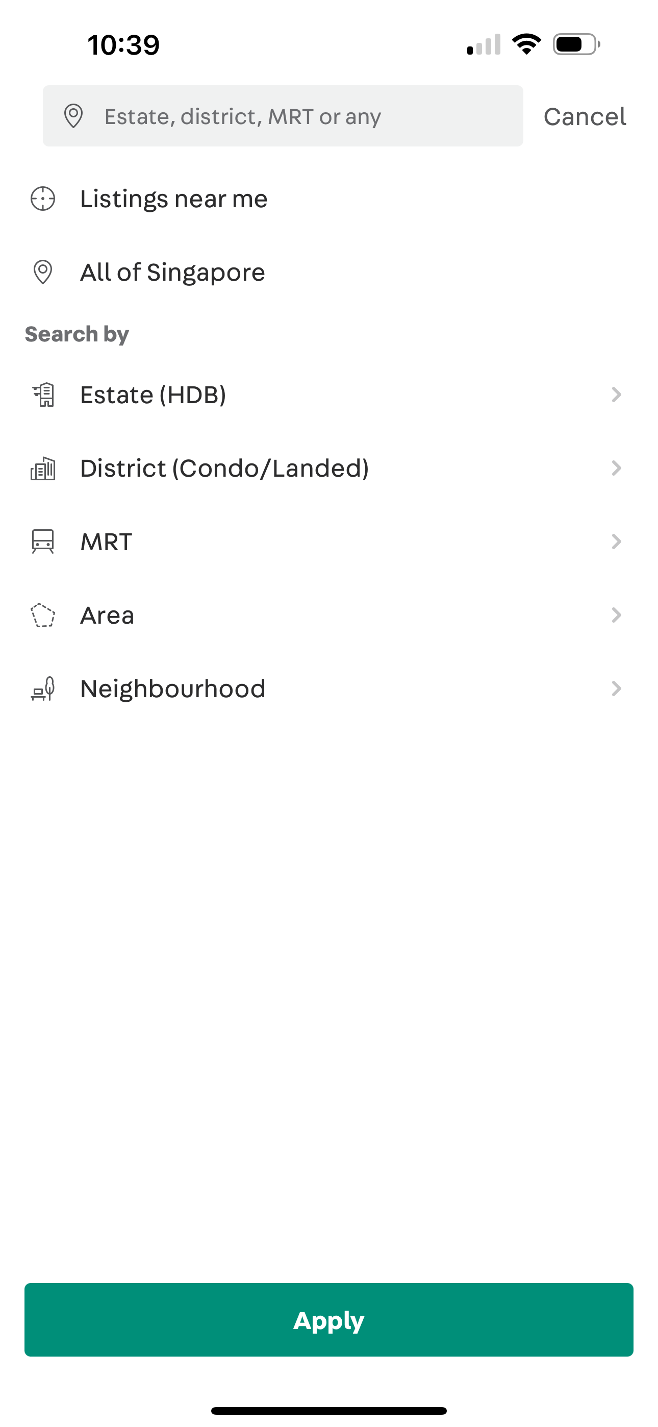
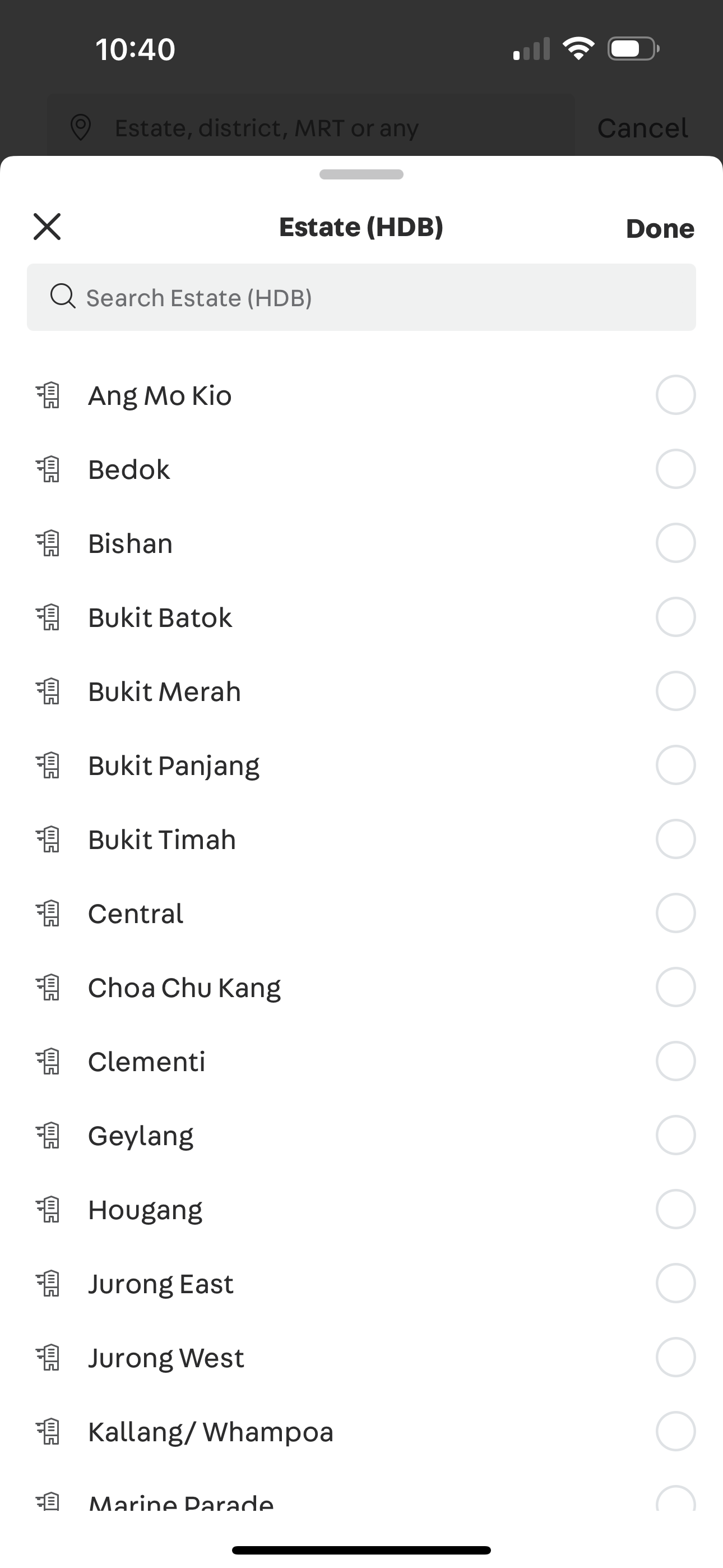
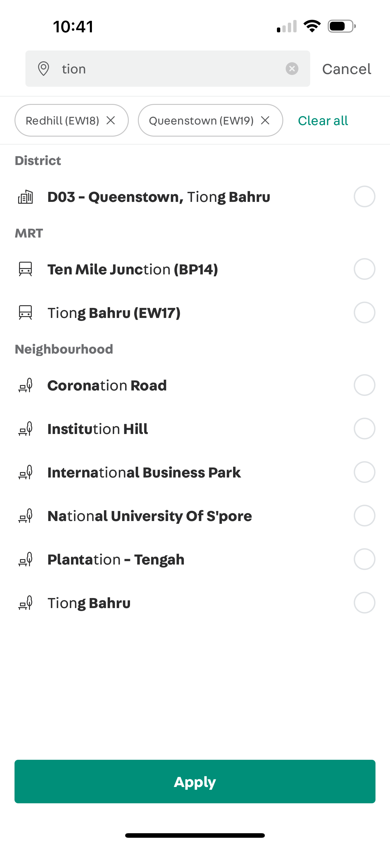
Localise for different countries
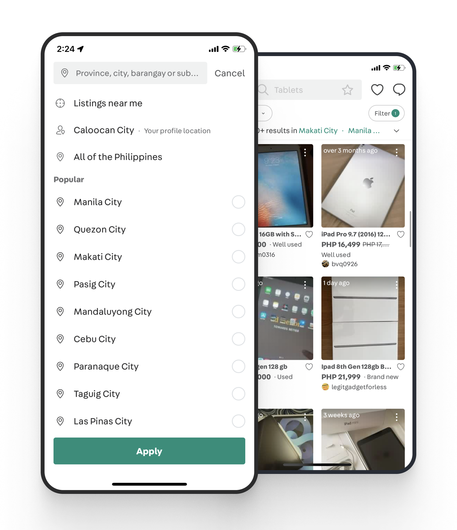
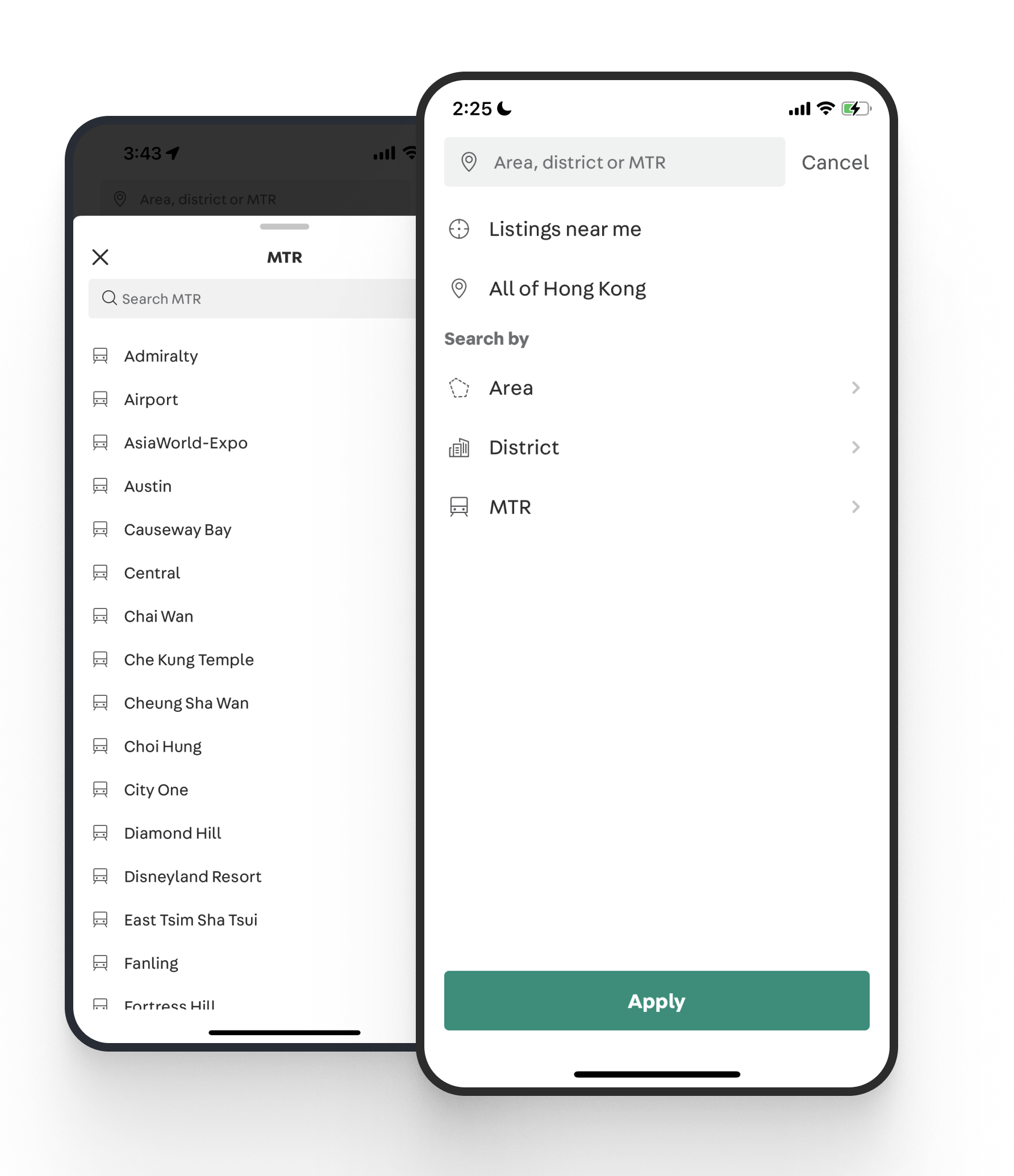
For big countries like the Philippines, Malasia, Indonesia, we focus on search experience. People can search by Province, City, or Baranggay.
For city-state countries like Singapore, Hong Kong, Taiwan, people can also browse by MRT, Area, or Neighbourhood.
Micro-interactions
We want to have more meaningful things to spark joys to people, to connect them with our app, to make people feel they are interacting with a human, not a cold machine.
There are many opportunities for us to delight our users with meaningful animation.
Sparkl for introducing a new feature
Like animation to encourage people to like more
Long-press to show people a glue to interact for more actions
Bottom sheet animation
The First Release: Low usage but good Conversion Rate (CR)
After 5 months of design and implementation, we released it first in PH in Dec 2020. One month went by, we got the data and some qualitative feedback from users:
- The usage is lower than we expected: lesser people use the location picker, comparing to the old one.
- But on the other hand, the CR funnel improved a lot. The funnel when people browse → Chat increases by +18%.
At least, we know that the new solution brings a better experience, people can find things they want easier. Then the main questions are why the usage is very low and how to increase the usage.
The Next Iterations Continous Learn & Improve
Then I collaborated with a PM, DA to analyze the data. The reason we found out is the sticky behavior of the entry point.
Why did we know? Because before we launched the new design, we had made a change in the behavior of the entry point of the old location picker. The usage declined from the time we made that change.
Besides data, we also receive some user feedback sent to our User Voice team.
“The items do not appear compared to the old search mechanics” – Kim
“Location search was accurate in the previous version. Updates showing (listings) very far locations from my city which is not accurate” – Mico
So not only the design, but we need to change also the logic of the result page.
When we want to increase the usage of a feature, we are tempted to use onboarding or tooltip to tell people about that new feature. That’s always our first thinking.
But explaining to people how to do something is a sign of bad design. So what did we change?
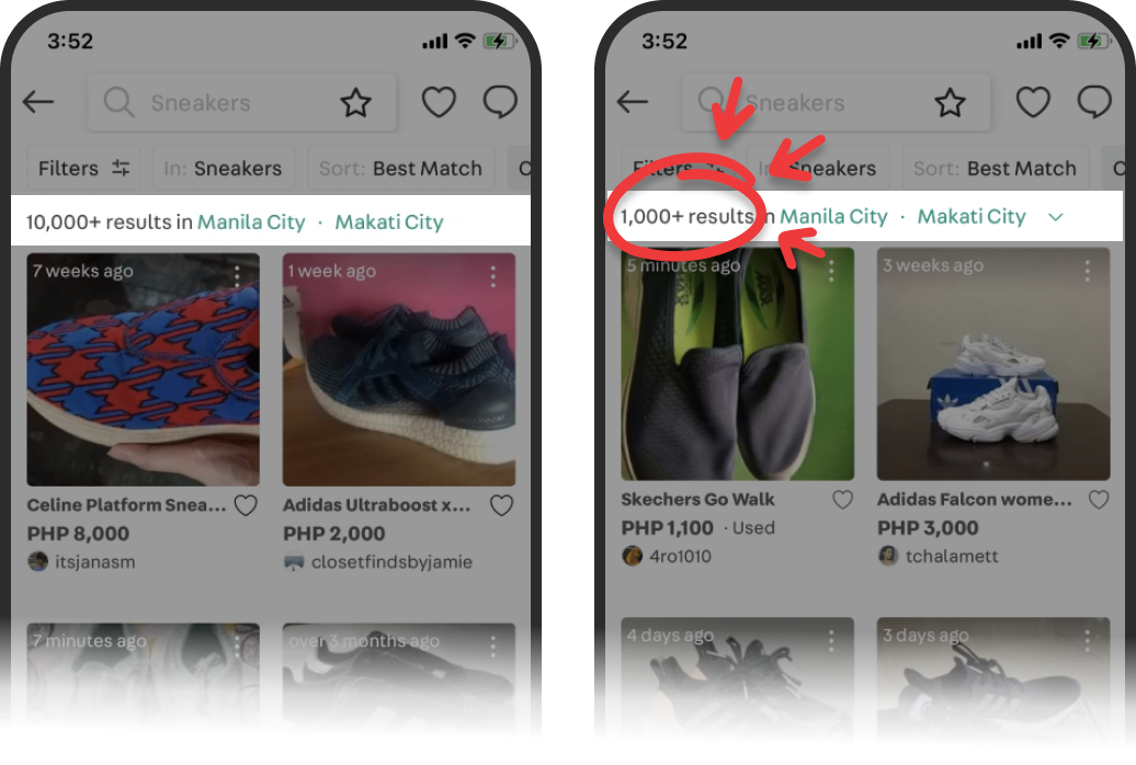
Sticky entry point
(1st release) The entry point is flown when scrolling down
(New release) Make the entry sticky on top and adding a chevron to make it more visible and tappable.
A/B test the logic filtering listings
Results after Iterations
Through some iterations that learning from data and user feedback, we got great impacts:
- +80% in feature usage
- +18% in browse → chat
- +28% in browse → quality chat
- +150% like interaction

Launching is only the first step. At Carousell, we always iterate the product with data and post-launch research.
We launched it first for the Philippines, Singapore, Hong Kong. Then Taiwan, Malaysia, and Indonesia later.
For confidentiality reasons I have omitted the actual values for these metrics.